March 16, 2026
The Anatomy of an Iconic Logo: A Guide by an Advertising Agency in Chandigarh
A good logo tells people who you are. A great logo tells people what you believe in. In a world where consumers are bombarded by thousands of visual cues every day, your brand mark has mere seconds to make an impression. It is the face of your business and the silent ambassador of your values. Creating something that sticks requires more than just a flair for aesthetics. It involves a deep understanding of psychology, strategy, and cultural context. As a leading advertising agency in Chandigarh, we have seen how a well-crafted visual identity can transform a local business into a household name.
The Power of Distinction
To be iconic, a logo must first be unique. It needs to stand out in a crowded marketplace without being overly complex. A distinct logo avoids clichés and focuses on a proprietary shape or concept that belongs solely to the brand. When a design is too generic, it fails to build brand equity because it blends into the background. Distinctiveness ensures that even at a glance, the consumer knows exactly who they are dealing with.
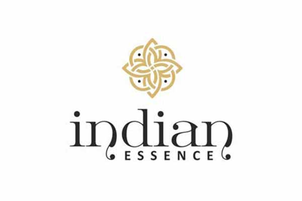
Mantrin understands that uniqueness is the cornerstone of brand recall. For instance, look at the logo for Indian Essence. Instead of using overused yoga silhouettes, the design uses an intricate, symmetrical geometric pattern that evokes a sense of balance and traditional wisdom. This distinction allows the brand to own a specific visual space in the wellness industry.
The Gestalt Principles of Unity
The Gestalt principles suggest that the human brain perceives a whole image as being more than the sum of its individual parts. In logo design, this means using psychology to create a "unified whole." Principles like Continuity, Proximity, Similarity, and Closure allow the viewer to fill in the gaps and perceive a complete message effortlessly. If one element feels out of place, the entire brand message can feel fragmented or unreliable.
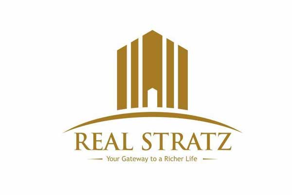
The team at Mantrin utilised these principles when designing the identity for Real Stratz. By using Proximity and Similarity, the vertical pillars are arranged to form the silhouette of a building. The use of a curved horizon line at the base creates Continuity, leading the eye upward and providing a solid foundation. These elements work together to create a singular, stable feel, ensuring the brand appears sophisticated and well-integrated.
Industry Alignment and Communication
An iconic logo should subtly communicate or suggest the products and services it represents. While a logo does not need to be a literal illustration of what you sell, it should "feel" like the industry it belongs to. This alignment helps manage consumer expectations and builds immediate trust. The choice of colours, line weights, and symbols should all point toward the brand's core mission.
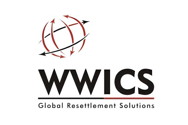
Mantrin has mastered the art of industry-specific suggestion, as seen in the WWICS logo. The use of a globe is an immediate visual shorthand for international reach and global movement. By layering directional arrows over the sphere, the design communicates the core service of immigration and resettlement. It tells a story of global transition and visa solutions without needing a single line of explanatory text.
Adaptability and the Dark Mode Era
In the modern digital landscape, a logo must be a chameleon. It needs to look just as good on a giant billboard as it does on a tiny smartphone screen. One of the most critical technical requirements today is having a white knockout version of your logo. Since many users now prefer "dark mode" on their devices, your logo must remain legible against dark or busy backgrounds. If a logo loses its impact when the colours are reversed, it is not truly functional.
At Mantrin, we prioritise adaptability to ensure brands remain visible across all platforms. Every project, from real estate to retail, undergoes rigorous testing for scalability and contrast. A logo that maintains its integrity in a single-colour knockout format is a logo that is built for the future. This technical foresight ensures that the brand’s visual power is never diluted by a change in background or device settings.
Emotional Resonance through Symbolism
Great logos often tap into deep-seated emotional triggers through symbolism. Whether it is a crown suggesting authority or a punctuation mark suggesting a journey, these symbols bypass the analytical mind and speak directly to the viewer's intuition. When these symbols are combined with the right colour palette, they create a "vibe" that defines the brand's personality before a single word is read.
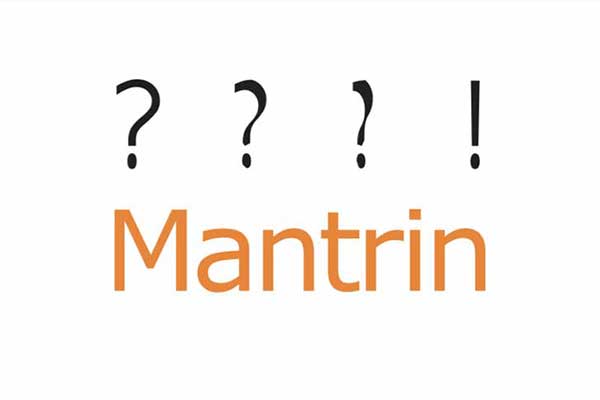
For our own brand, Mantrin, we use the evolution of punctuation. The dots transitioning into a question mark and finally into an exclamation point symbolise the journey of a creative agency. It represents the transition from curiosity and inquiry to the "Aha!" moment of a brilliant solution. This symbolism tells our clients that we are problem-solvers who turn uncertainty into impactful results.
Projecting a Definitive Identity
A logo's primary job is to project a specific identity that aligns with the brand’s mission. Every design choice, from the thickness of a line to the curve of a symbol, is an intentional move to shape public perception. Whether a brand wants to appear approachable and friendly or authoritative and established, the visual cues must be consistent. Sometimes, the identity a brand needs to project is one of high-tier quality and exclusivity to match its market position.
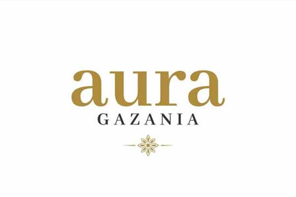
Mantrin creates visual marks that project exactly what the brand stands for. In the cases of Aura Gazania and Nairey Gold, both brands required an identity that projected premium status and excellence. For Aura Gazania, the symmetrical floral emblem projects a serene, upscale lifestyle. For Nairey Gold, the regal crest projects a sense of heritage and superior craftsmanship. While the specific identity in these examples happens to be luxury, both utilise gold colour palettes as a strategic tool to communicate that high-tier positioning clearly to their audience.
Defining Your Market Presence
Building a brand identity is a journey that requires both creative vision and technical precision. If you are looking to define your presence in the market, partnering with a specialised logo designing company in Chandigarh can provide the strategic edge your business needs. Your logo is an investment in your company's future, so ensure it is built on a foundation of clarity, unity, and adaptability. We recommend auditing your current visual identity to see if it truly reflects the heights your business aims to reach.
FAQs
1. What core services does Mantrin provide to businesses?
Mantrin is a full-service agency offering 360-degree marketing solutions. Our expertise spans brand consulting, creative designing, digital marketing, and media planning. We help brands grow by combining insightful strategy with innovative, high-impact creative execution across all media platforms.
2. How long has Mantrin been operating in the advertising industry?
Established in 2001, Mantrin has over 25 years of brand legacy. We have partnered with over 1000 brands, earning more than 35 awards. This extensive experience allows us to provide seasoned insights that drive measurable business growth.
3. Can Mantrin help my brand with digital transformation and SEO?
Yes, we are a frontrunner in digital marketing. Our team specialises in SEO, social media marketing, and web development. We optimise your online presence to amplify visibility and drive traffic, ensuring your brand stays competitive in the digital era.
4. How does Mantrin approach the creative process for a new logo?
We view design as a strategic tool. Our process begins with identifying your brand purpose and market positioning. By applying design principles and keeping your brand presence in mind, we create a logo that is distinct, unified, and industry-aligned.