August 11, 2026
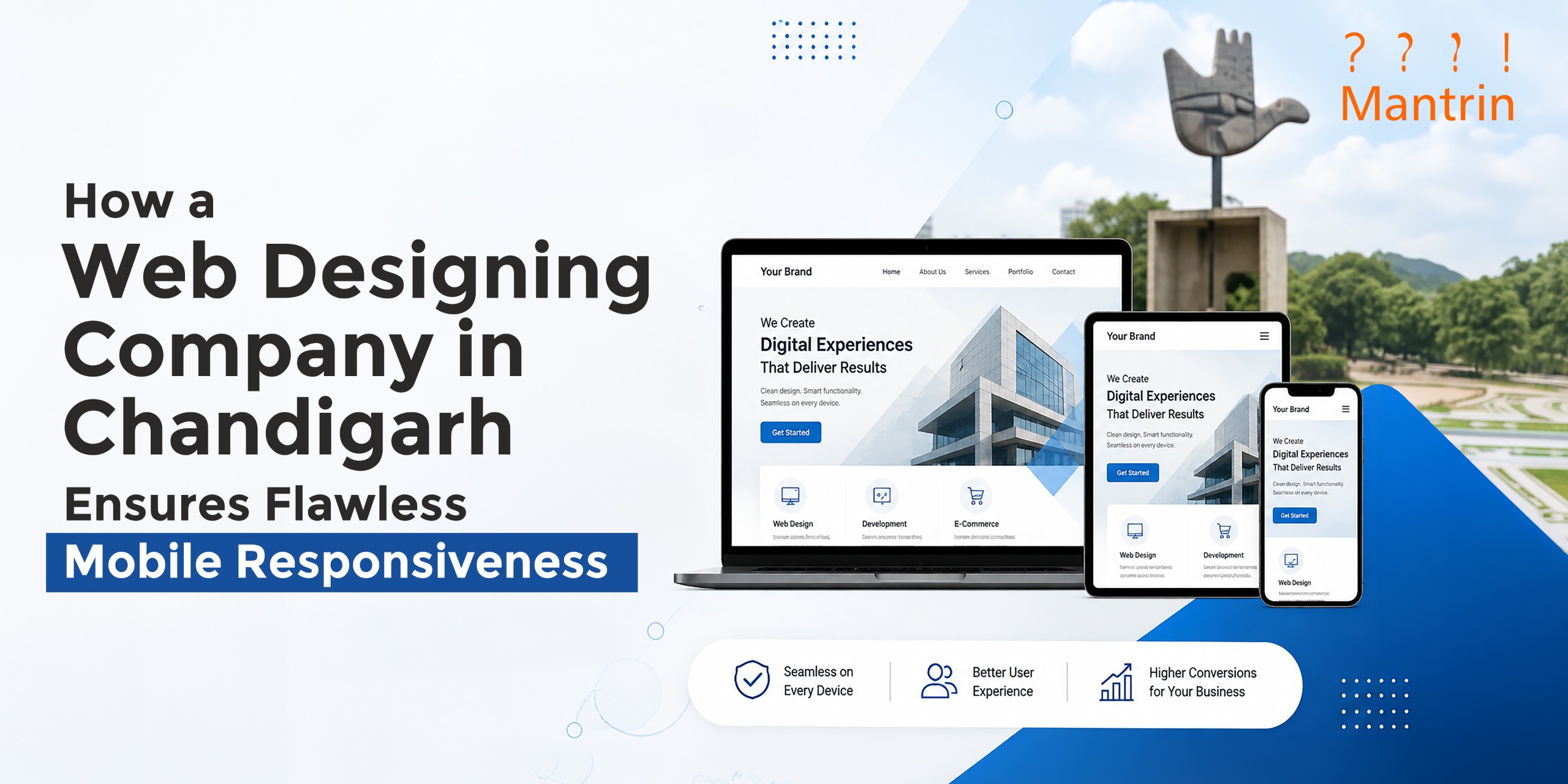
How a Web Designing Company in Chandigarh Ensures Flawless Mobile Responsiveness
We have all been there: you open a website on your mobile, only to find microscopic text, buttons too tiny to tap with your thumb, and images spilling off the screen. It takes less than three seconds of frustration for a visitor to close the tab and head straight to a competitor. This is the reality every business faces today, and it is exactly why more brands are turning to experienced web designing companies in Chandigarh to make sure their site works as well on a five-inch screen as it does on a desktop. Mobile responsiveness is not a bonus feature anymore. It is the baseline expectation.
1. Why Mobile Responsiveness Isn't Optional Anymore
More than half of all web traffic today comes from mobile devices, and search engines now judge websites primarily on how they perform on mobile. A site that looks polished on a laptop but breaks apart on a phone is not just an inconvenience for users. It is a signal to search engines that the experience is incomplete. This affects rankings, bounce rates, and ultimately, revenue. Businesses that treat mobile as an afterthought often end up redesigning their entire site later, at a much higher cost, simply because they built for the wrong screen first.
2. The Limits (and Opportunity) of Phone Screens
A phone screen comes with real constraints. Less space to work with, smaller keyboards, weaker processing on budget devices, and users who are often multitasking or distracted. These limits can feel restrictive, but they also push a website to become sharper. When there is no room for clutter, every word and button has to earn its place. Mantrin treats this constraint as a design advantage rather than a problem to work around. A smaller screen also means the phone is almost always within reach, which opens the door to features a desktop simply cannot offer, like click-to-call, WhatsApp chat, location-based content, and instant notifications. The same limitation that forces simplicity also creates closeness with the user.
3. Designing for Touch, Not Just Screens
Mobile responsiveness is not only about resizing a page to fit smaller dimensions. It is about rethinking how people actually interact with a screen using their thumb instead of a mouse. At Mantrin, this shift in thinking shapes every mobile layout the team designs. A responsive site should:
• Use buttons large enough to tap without zooming in
• Keep navigation menus simple and thumb-friendly
• Avoid layouts that depend on hover effects
• Space out clickable elements to prevent mis-taps
Getting these small details right is often what separates a site that feels natural on mobile from one that feels like a shrunk-down desktop page.
4. Speed Is Part of Responsiveness
A responsive design that takes eight seconds to load defeats its own purpose. Mobile users are often on the move, switching between apps, tabs, and spotty networks. If a page is slow, no amount of clever layout will keep someone engaged. Image sizes, code structure, and hosting all play a role here. Heavy, uncompressed images are one of the most common reasons mobile sites feel sluggish, even when the design itself looks clean. Responsiveness and speed need to be treated as one problem, not two separate checklists, because a beautifully adaptive layout that loads slowly still fails the user in the end.
5. Testing Across Real Devices, Not Just Simulators
Browser tools can preview how a site might look on different screen sizes, but previews are not proof. Screens vary, operating systems vary, and browsers render things differently. Mantrin approaches testing as a non-negotiable step, not a formality:
• Checking layouts on actual phones and tablets, not just simulated views
• Reviewing how forms and buttons behave on iOS versus Android
• Testing load times on slower mobile networks
• Confirming that images, videos, and menus adjust correctly across devices
This hands-on approach catches the small inconsistencies that automated previews tend to miss, the kind of issues that quietly frustrate users without ever showing up in a design mockup.
6. Content That Adapts, Not Just Shrinks
Responsiveness also extends to how content is structured, not just how it looks. A paragraph that reads comfortably on a desktop can feel overwhelming on a small screen. Headlines, spacing, and even the order in which content appears may need to shift for mobile users to get the same message with less effort. Tables, forms, and long menus especially need rethinking, since what works as a wide grid on desktop often needs to become a simple stacked list on mobile. The goal is not to shrink everything into a smaller box, but to reorganise it so it still makes sense.
Getting Responsiveness Right the First Time
A website that works beautifully on every screen does not happen by accident. It takes deliberate design decisions, careful testing, and a willingness to prioritise the user's experience over convenience during development. This is where working with the best web development & designing company in Chandigarh makes a real difference, since it usually means fewer redesigns, better search visibility, and a site that keeps working as devices and screen sizes keep changing. Mantrin's approach to this has always been to build for how people actually use their phones, not just how a design looks in a mockup.
If your website still feels clunky on mobile, it may be worth getting it reviewed before it costs you visitors. A short audit can often reveal exactly where the friction is coming from.
FAQs
1. What does mobile responsiveness actually mean for a website?
It means a website automatically adjusts its layout, text, images, and navigation to fit different screen sizes, so users get a smooth experience whether they are on a phone, tablet, or desktop.
2. Why does mobile responsiveness affect search engine rankings?
Search engines primarily evaluate websites based on their mobile version. A site that loads slowly or displays poorly on mobile can rank lower, even if the desktop version looks perfectly fine.
3. How can I tell if my current website has responsiveness issues?
Common signs include text that requires zooming, buttons that are hard to tap, slow load times on mobile data, and layouts that look broken or misaligned on smaller screens.
4. Does Mantrin offer SEO services after a website has been launched?
Yes. Mantrin offers full post-launch SEO services, including technical audits, on-page optimisation, content strategy and performance tracking. We ensure your site ranks well and works flawlessly on every screen. SEO is an ongoing partnership, not a one-off task.